
I started with inspiration of a shield and figured i wanted some sort of Epic looking landscape.
I wanted a really neat looking shield, and it took me a while to find one on google images. I eventually found this one..

I noticed right from the get go that I wanted to change up the shield's wording and the battle hammer into a cross. First I removed the surrounding background. I then was able to remove the wording from the banner by pasting pieces of the surrounding red banner over top of it. The battle hammer to cross transition was just a matter of removing the upper half of the hammer and copying and pasting a part of the lower handle as the top of the cross.
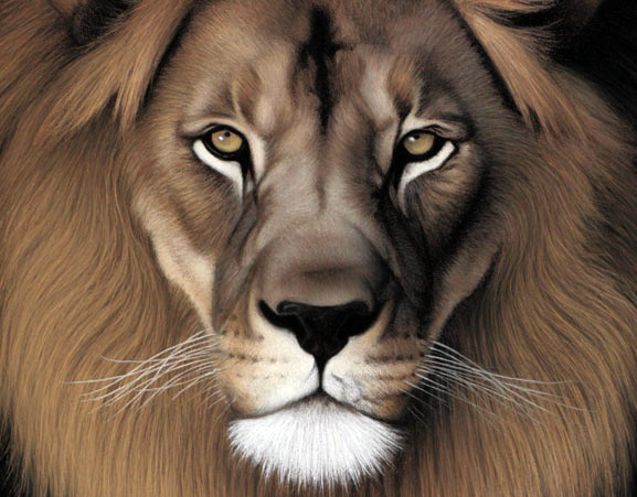
The next thing I wanted to do was change the skull into a lion. War Of Ages has used a lion in it's identity in the past. I downloaded the lion in this picture from google.
I then scaled it down and adjusted the opacity and placed it over the skull for a transparent look.
 The next thing I did was add the traditional War Of Ages typography logo to the top of the shield. the finished shield came out like this:
 For the landscape I wanted something epic looking. A smokey battlefield vibe, yet vacant. I decided to find a cloudy elegant sky. I came up with a picture from google that had that quality.
I followed that up with a smokey mountainous picture i found. I cut the mountains out of this picture and used an eraser with glowing edges to avoid an ugly fringe between the mountains and sky.
 After those were put together I used a desert piece of land from this photo to add the near-ground where I wanted to have the shield half buried.
 To pull this off with all the different pieces of land and sky from several different pictures..I utilized the glowing edge brush and adjusted the contrast and lighting effects pretty heavily.
The result was, I think, a perfect setting for the shield:

For the addition of the shield to the landscape I simply pasted it and trimmed off the bottom left corner for the buried look. I added a stroke to the outline of the "War Of Ages" wording. I then added the word ETERNAL to the banner and put a motion blurred layer underneath it for some wear and tear. I adjusted the lighting effects to finish things off.
Once everything was put together I was really happy with how it looked. I think it is probably my favorite and most complex design I've done thus far. Here's the finished product!
